Managing safety in the workplace is at the forefront of successful business practices and with Quantum’s new Hazard Reporting software, keeping your workers safe has never been easier. Time once spent manipulating spreadsheets and filling out paper reports can now be allocated to implementing measures that correct and prevent safety hazards.
Quantum’s Hazard Reporting software collects information from employees, who submit reports via the mobile app. This information is converted into data analytics that are simple and easy to understand. All of the data provided in the dashboard is compiled into charts that safety managers can use to track and analyze safety hazards in the workplace. These charts put the raw data into context and give the safety manager a more accurate representation of why and how each incident occurs, taking the guesswork out of addressing safety concerns and making corrective action plans more efficient and effective. The dashboard also features real-time risk tracking that allows users to catch repeat incidents before they occur, improving overall workplace safety performance.
Data is represented on the dashboard using three separate reports: Observed Hazards by Frequency, Estimated Risk Exposure by Hazard, and Cause Frequency Over Time.
Observed Hazards by Frequency
The Observed Hazards by Frequency dashboard allows safety managers to assess how frequently hazards occur, find the probable cause of a hazard, and analyze the severity of both hazards and causes. With this information, safety managers can make more informed decisions and implement more effective corrective plans.
In Figure 1, the safety manager uses the dashboard to compare observed hazards based on severity-weighted frequency of each hazard and determines that the most frequent safety hazard in the facility is falls.
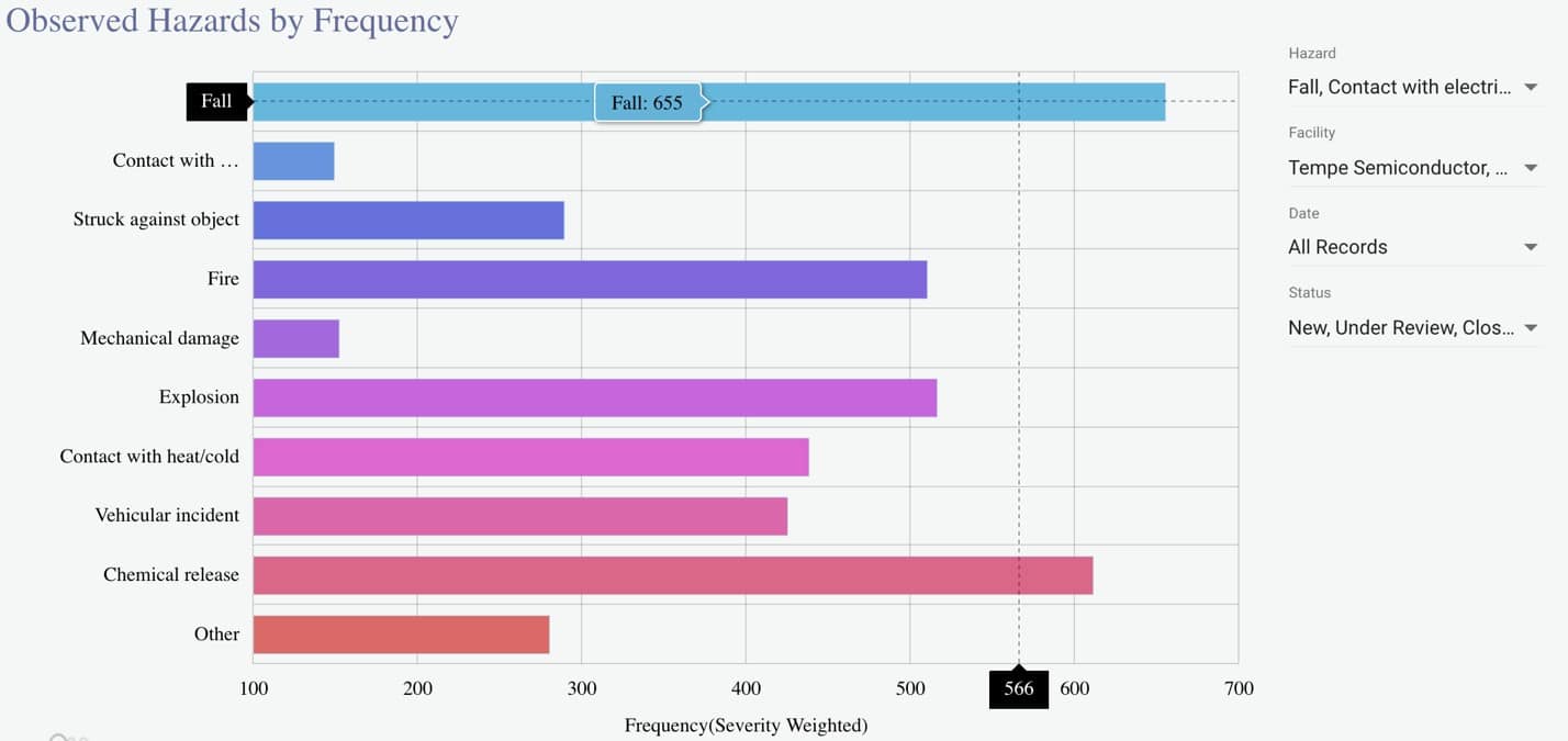
After identifying the most common hazard, the safety manager investigates further and “drills down” into the more specific metrics about observed fall hazards by clicking on the bar next to “Fall.” Doing this generates a new graph that compares the severity weighted frequency of contributing causes of falls in the workplace, as seen in Figure 2.
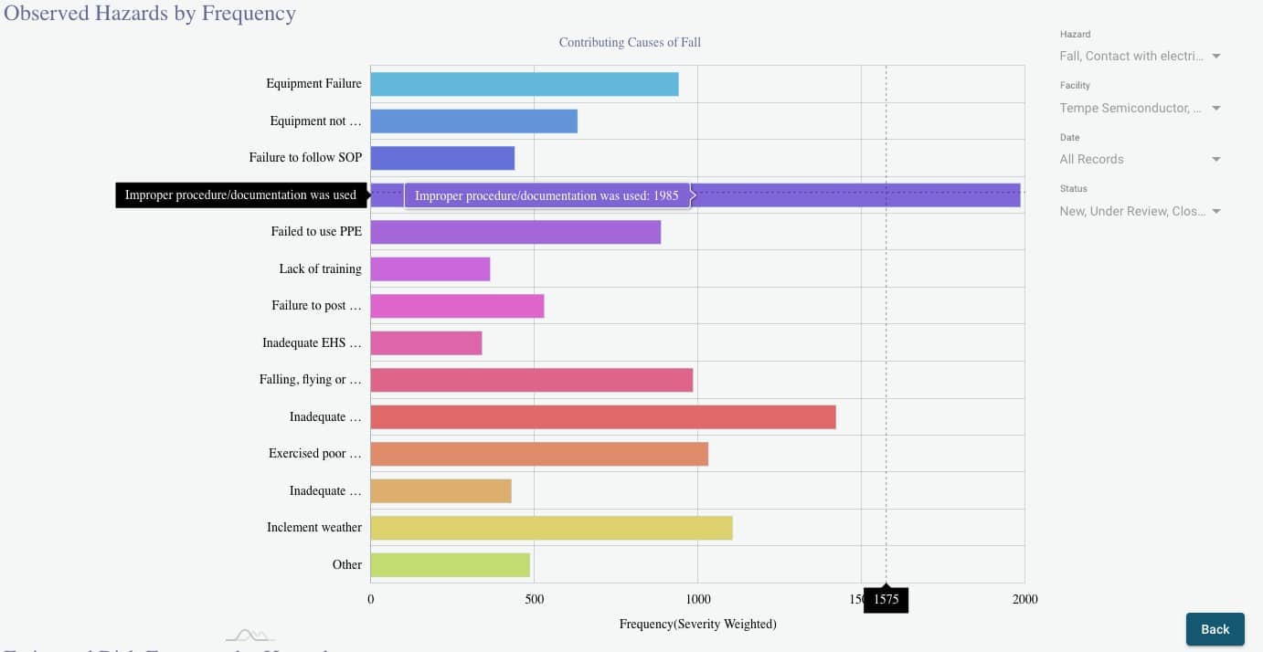
Using this second graph, the safety manager identifies the most probable cause of falls–improper procedure/documentation was used. With this information, the safety manager then creates and initiates a corrective action plan to address and prevent falls caused by using improper procedure/documentation.
If the safety manager wishes to pursue further fact-finding, they can click on the bar that corresponds with the cause to be redirected to a search results page of observations pertaining to the cause.
The Observed Hazards by Frequency report is invaluable to safety managers because it compiles the raw data gathered from employee-submitted reports and turns it into easy-to-read graphs that save them time and give them a more accurate understanding of why and how safety hazards arise, how often hazards occur, and how severe each hazard is. This, in turn, allows them to create effective action plans that more accurately address and prevent hazards, making the workplace safer for everyone.
Frequently Asked Questions
Q: How do I identify which hazard happens most frequently in my company?
A: Use the Observed Hazard by Frequency dashboard and find the longest bar.
Q: How do I initiate a corrective action plan targeted at this hazard?
A: Click the hazard bar and drill down into the bar chart with that hazard and the related causes. The longest bar on the graph represents the most frequent contributing cause to this hazard. Your corrective action could start there.
Estimated Risk Exposure by Hazard
The Estimated Risk Exposure by Hazard report gives safety managers an overview of the company’s risk exposure.
Using the dashboard pictured in Figure 3, the safety manager compares all hazards at every location using data from every recorded observation. The Y-axis displays the raw frequency count, while the X-Axis displays the average severity.
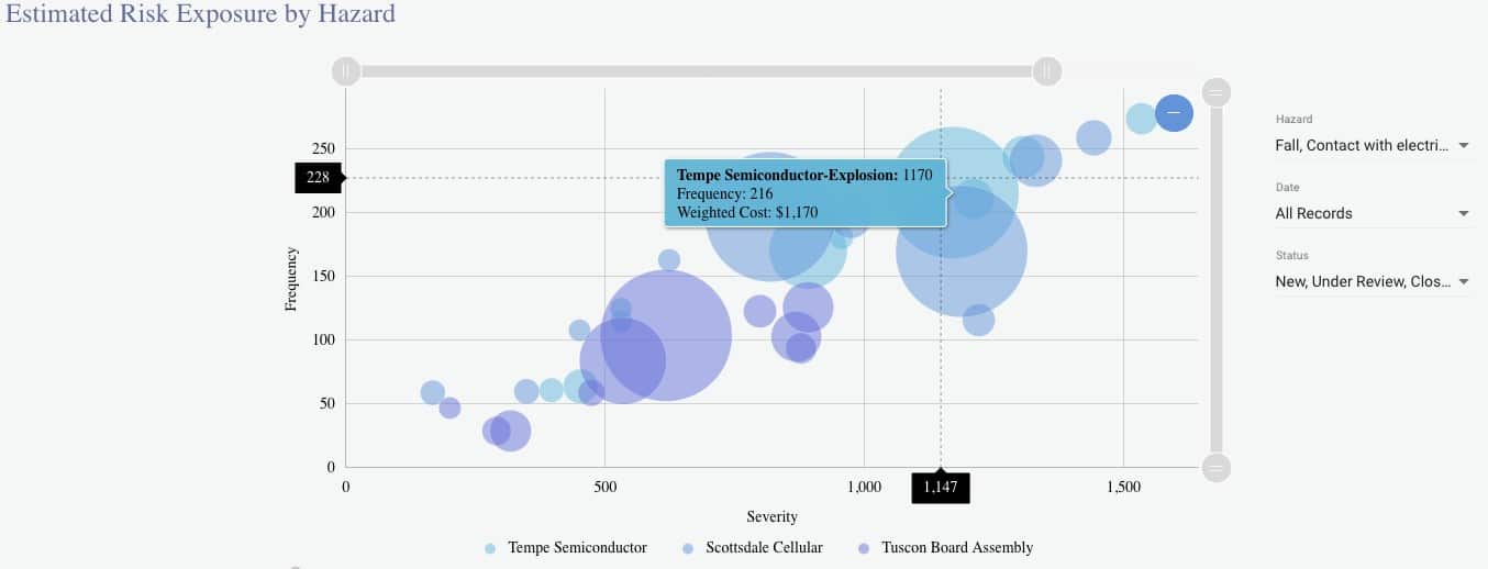
The bubbles in the chart represent Hazard Reporting records from various company facilities. The color of each bubble is dictated by the location of the recorded hazard, and the size of each bubble is determined by the estimated total cost the company incurs from the recorded observations. The higher the cost of a hazard, the bigger the bubble. When the safety manager hovers over a bubble, they are able to see the location, hazard, frequency, and weighted cost of the records that the bubble represents.
In Figure 3, the safety manager observes that the bubble’s positioning in the upper right region of the graph indicates that explosions are a severe safety hazard that occurs frequently at that location and, based on the size of the bubble, concludes that explosions cost the company a lot of money. They can then compare these results with the results of other locations to evaluate the safety performance of each facility and pinpoint the weakest link.
For further investigation, the safety manager can click on the bubble to be redirected to the search results page for observation reports of explosions at the Tempe Semiconductor facility and analyze the severity of individual records.
The Estimated Risk Exposure by Hazard report gives safety managers a visually comprehensive representation of how the company’s facilities compare to one another, revealing which locations are dangerous and costly and which are safe and cost-effective. By evaluating this report, safety managers are able to pinpoint the safety leading indicators within the company.
Frequently Asked Questions
Q: How do I know which facility performs better?
A: The different colors of the bubbles represent different facilities. If a facility’s bubbles are mostly smaller in size and are located at the bottom left corner, this means the facility poses a low exposure risk because the hazards are less frequent or less severe.
Q: How do I know which hazard costs a lot?
A: The size of a bubble is determined by the estimated hazard cost of the records. The bigger the bubble, the higher the potential cost of risk.
Q: How do I compare the frequency and severity between two hazards?
A: By comparing the location of the two bubbles, you will get an idea of the frequency and severity between two hazards. The higher up on the graph a bubble is, the more frequent that hazard occurs, and the further to the right a bubble is located, the higher the average severity is. You may want to use the hazard located closest to the upper right corner of the graph as the target of your next corrective action plan.
Cause Frequency Over Time
The final report available on the Hazard Reporting is the Cause Frequency Over Time chart.
The Hazard Reporting chart displays the metrics for reports of a selected cause or causes over time using month-to-month frequency. When users analyze multiple causes, all records containing any of the hazards selected are included in the data used to generate the resulting graph.
In Figure 4, the safety manager is analyzing how the frequency of multiple causes have changed from January 2017 to January 2019. The X-axis displays the passage of time and the Y-axis displays the weighted frequency.
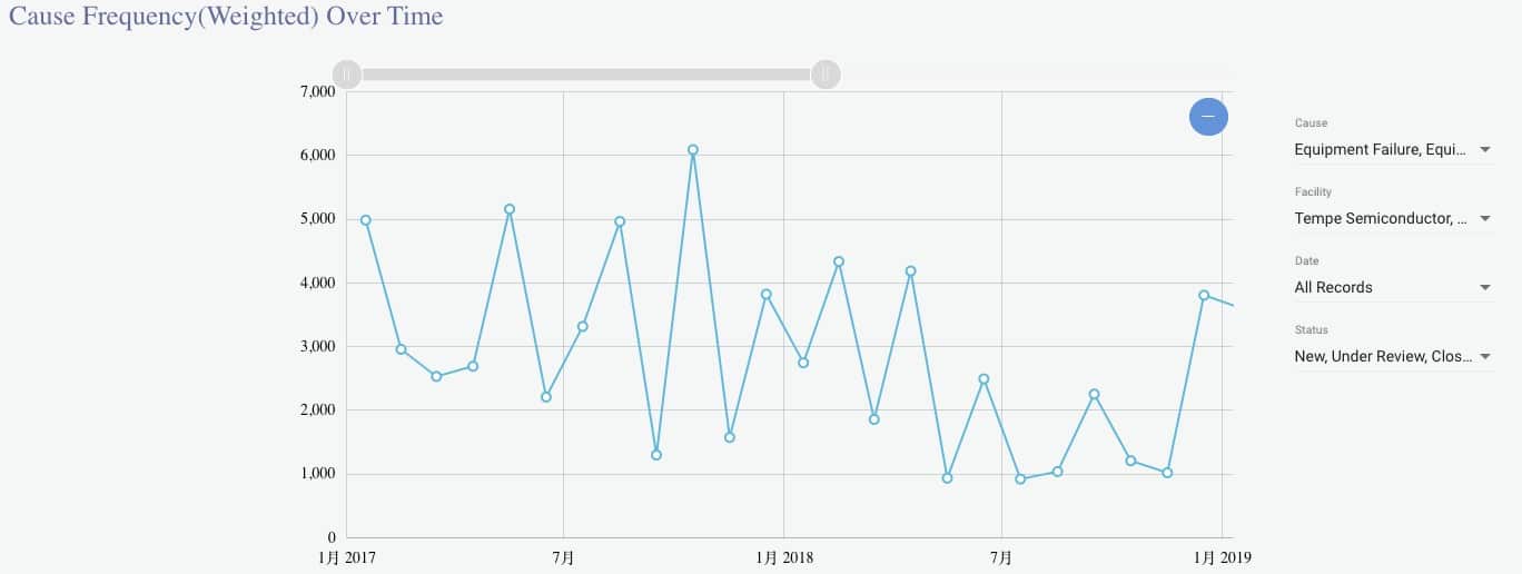
The safety manager is able to see the impact of corrective actions and can use the information to adjust corrective actions when they do not result in a decreased frequency of incidents. Alternatively, they can use this data to identify times when corrective actions did work and potentially reinforce corrective actions that led to fewer incidents in the past.
The safety manager can also use this report to show his supervisors how corrective actions have prevented hazards and led to safer, less costly work environments.
Frequently Asked Questions
Q: How do I present to my boss the return of investment from a corrective action plan?
A: A corrective action is typically assigned to a cause. Using the Cause Frequency Over Time report, you could prove the effectiveness of corrective actions by showing them the dropping trend of hazardous performance.
Q: How do I find systemic risk over the years?
A: You could look for a certain cause changing trend over the years. If the cause gets higher periodically, you may want to consider implementing corrective action to prevent future occurrences.
Quantum’s Hazard Reporting Software offers users a better way to manage safety in the workplace. Safety management has never been easier or faster than with all that is included on the Hazard Reporting dashboard.
Quantum’s Hazard Reporting Software is available on our Software as a Service (SaaS) platform. Request a demo today to revolutionize your company’s approach to safety.